
 Back to articles
 David Zelenka

Colors shape how people see your brand and what they notice on your website. But they don't work like a chart of meanings along the lines of “red sells, blue builds trust.” What matters more is whether the color fits the product and whether the important things stand out from their surroundings. In this article, you'll find what the research says, which famous numbers have nothing behind them, and how to choose colors.
Picture yourself shopping for new shoes. You open 2 online stores with a similar selection and similar prices. The first one greets you with calm, earthy green and cream. The second one screams neon orange at you from every corner. Which one do you stay on longer? And which one are you more likely to buy from?
Almost everyone will tell you “the green one.” But if the second store sold sneakers for teenagers, it could be exactly the other way around. And that's where color psychology begins – and it's more interesting than the charts that keep circulating online.
How colors influence customer decisions
Color is one of the first things you register about a brand, and it carries meaning. When it fits the product and what the brand should express, it helps. When it doesn't, it confuses.
Surveys confirm that people care about color. In March 2025, Adobe asked 1,000 Americans, and half of them said they had chosen one brand over another just because of its color at some point [1]. But that's what people say about themselves, not a measurement of what they actually bought. Good as a signal, weak as proof.
Science is more cautious. In a review for the Annual Review of Psychology, psychologists Andrew Elliot and Markus Maier concluded that color really does affect emotions, thinking, and behavior, but that the research is still at an early stage and older studies suffered from methodological weaknesses [3]. So colors do work. Just not as simply as people write.
Where “90% of a judgment is based on color” comes from
The most quoted number in color psychology goes like this: people make up their minds about a product within 90 seconds, and 62–90% of that judgment is based on color alone. You'll find it in almost every article on the topic.
When you start tracing it, you end up at a 2006 review article by Satyendra Singh [2]. But Singh didn't run an experiment of his own – he summarizes older literature and takes the number from the “Institute for Color Research.” The original study, with its method and sample, can't be found. Through repetition on blogs, “color affects first impressions” turned into “color decides 90% of a purchase.”
What different colors mean in marketing
Color associations exist, and they can be measured. The best evidence comes from Lauren Labrecque and George Milne, who ran 4 studies on how the color of a logo changes the perceived personality of a brand [4]:
| Color | How people perceived the brand |
|---|---|
| Red | exciting, energetic |
| Blue | competent, reliable |
| White and yellow | sincere |
| Black, purple, pink | sophisticated |
| Brown | rugged, tough |
Interestingly, the hue isn't the only thing that matters. More saturated colors came across as more exciting, while lighter ones seemed more sincere and sophisticated. The same blue can express the stability of a bank or the playfulness of a kids' app – depending on how saturated and how light it is.
The second question is whether the color fits the product. Paul Bottomley and John Doyle found that for functional products, people rate “functional” colors like blue more highly, and for products built on experience and the senses, colors like red [5]. A color doesn't work on its own, but in combination with what you sell.
Banks show that the chart isn't a law, either. Santander has built its brand on red since 1989 – it chose the color specifically to stand apart from its competitors [6]. Red doesn't stop people from trusting it with their money. What weighs more than the hue itself is that the bank has used it for a long time and consistently.
Now to specific colors. For emotions, I draw on a large international study: Domicele Jonauskaite and her colleagues asked 4,598 people from 30 countries what they feel about 12 colors, and the answers largely matched across countries [7]. But an association doesn't yet mean an effect on buying – for most colors, that has been measured little or not at all.
Red. Discounts, sales, warnings. People associate it with both love and anger [7], and in a logo it comes across as exciting and energetic [4]. It has retail data, too: men perceived prices written in red as bigger savings than prices in black. Women didn't, and for men the effect disappeared when they thought about the offer more carefully [8]. Where performance is at stake, it signals mistakes and danger – think of a teacher's red pen on a test [3].
Orange. Friendly and energetic, often used on buttons – like on this website. People associate it with amusement [7]. But there's no solid data that it raises conversions on its own – what mainly helps a button is contrast with its surroundings.
Yellow. Joy and attention. People almost everywhere associate it with joy, but not Egyptians [7], and in a logo it comes across as sincere [4]. Watch out with text: light yellow on a white background doesn't have enough contrast and is hard to read (more on that in the section on accessibility).
Green. Growth, calm, freshness, and “all good.” On traffic lights and in web interfaces, it means you can go ahead or that everything went through: in stock, shipped, paid. That's why food, health, and brands that want to come across as calm and balanced choose it. It also has a trap: green packaging improves how eco-friendly a brand seems – even for brands that aren't actually any greener [9]. If your business has nothing to do with sustainability, expect that people may assume it anyway.
Blue. Calm, reliability, technology, and finance. In a logo it comes across as competent [4], and in a study by Anya Hurlbert and Yazhu Ling it was the favorite color of both men and women [10] – though the participants were young adults, mostly British. When all your competitors use it, blue makes you blend in.
Purple. Luxury and creativity. In a logo it comes across as sophisticated [4], and people mostly associate it with positive emotions – Greeks, on the other hand, with sadness [7]. We have no data on how purple affects sales.
Pink. Tenderness and playfulness. People associate it with love, joy, and pleasure [7], and in a logo it comes across as sophisticated [4]. The shade matters a lot here: a saturated fuchsia feels different from a powder pink.
Brown. Earth, wood, coffee, craft. In a logo it comes across as rugged and tough [4], but of all the colors, people associate it with emotions the least [7]. It suits products whose strength is being “natural and honest,” but as a brand's only color it can look bland.
Black. Elegance, power, premium – typically fashion and luxury. In a logo it comes across as sophisticated [4]. Together with red, though, it's the color people most often associate with emotions, mainly sadness, fear, and hatred [7], so outside the premium world it can feel gloomy.
White. Purity, simplicity, space. In a logo it comes across as sincere [4], and people associate it with relief – Chinese participants with sadness, too [7] (more in the section on cultures). On websites, it mostly serves as the background that lets an accent color stand out.
Gray. Neutral and technical. People associate it with sadness and disappointment [7]. As a brand's main color it can feel cold, but as a supporting color or a text color it works well.
How to use it: Don't pick a color based on what it “means” in a chart. First get clear on what personality your brand should have, then look for a color – and a saturation – that supports it.
Why contrast matters more than the specific color
For buttons, calls to action, and prices, what matters more than the color is whether the element stands out from its surroundings. German psychologist Hedwig von Restorff described this principle back in 1933: in a list of similar items, people best remember the one that's different from the rest [11]. It's called the isolation effect.
The most famous button color test illustrates it nicely. The company Performable (later acquired by HubSpot) compared a green and a red button on its landing page and changed nothing else. The red one brought 21% more conversions [12]. That turned into “red sells.” But the authors themselves pointed out that red may also have won because it contrasted with the green in their website's colors. On a red website, the same test could have turned out completely differently.
And one more thing the quotes leave out: the test ran for a few days and had just over 2,000 visits. With a sample that small, it's easy to overrate the result.
On this website, we keep it simple. The brand is carried by dark green and light green, and orange is the conversion color. It marks a clear next step – a button, a link to book a meeting. Elsewhere, you'll only find it in small decorations and parts of icons, so when you see an orange button on a page, you know where to go next.
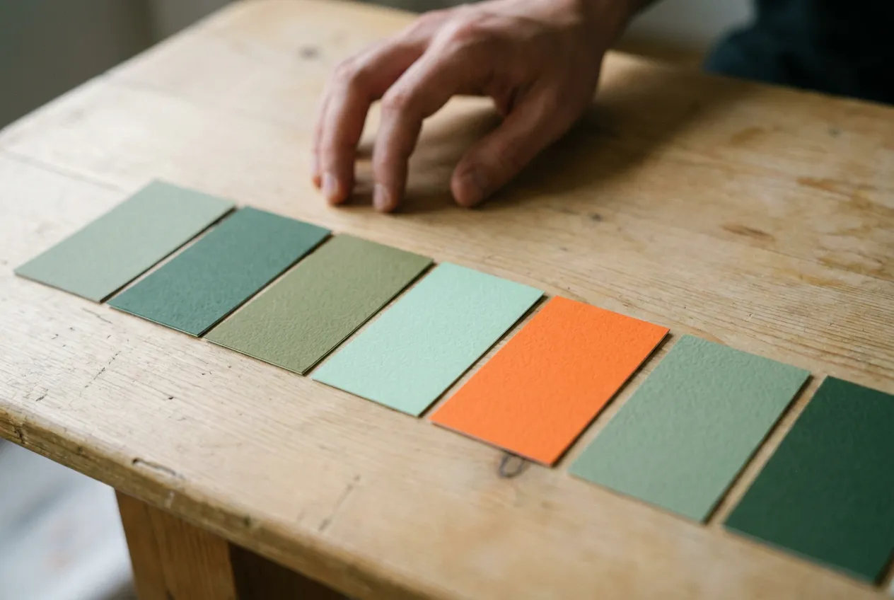
How to use it: Choose one accent color just for action – the button, the link to the cart, the booking. Don't use it anywhere else. Then stop asking “should the button be green or red?” and ask “does it stand out?”
Colors across cultures
If you also sell abroad, expect the same color to read differently in another country. A study in 8 countries showed that cultures agree on some color preferences and meanings and differ significantly on others [13].
A few examples worth keeping in mind:
- White is the color of purity and weddings in much of Europe and North America, but in China and other East Asian countries it's traditionally the color of mourning and funerals [14].
- Red is the color of luck and celebration in China, which is why it isn't worn at funerals [14].
- Green stands for nature and health in the West, but in China, “wearing a green hat” means your partner is cheating on you [15].
If you sell in a single market, this probably isn't a big issue. But as soon as you plan to enter a market with a different culture, go through at least your logo, packaging, and main campaign with local people.
Colors and accessibility
Some of your customers see colors differently than you do. Color vision deficiency affects roughly 1 in 12 men and 1 in 200 women – an estimated 300 million people worldwide [16]. If you convey information through color alone, some people won't see it.
That's why the web accessibility guidelines (WCAG) say color must not be the only way to communicate something [17]. A form field with an error should have text in addition to a red border, and stock availability should have the words “in stock” in addition to a green dot. And text should have a contrast ratio of at least 4.5:1 against its background [18].
How to use it: Switch your website to grayscale (on a phone, you'll find it in the accessibility settings) and go through a purchase. If you can still tell where to click and what's an error, you're in good shape.
How to choose colors for your brand and website
Don't choose colors based on what you like or on what your competitors use. Start from what your brand should express, and then check it in practice.
Consistency doesn't have to have anything to do with color psychology, either. At Little Shoes (sold as Footic outside Czechia and Slovakia), we recently added muted pastel colors to the palette and use them as accents in all our marketing channels. We didn't choose them for the emotions they're supposed to trigger, but so the brand looks the same everywhere.
What to take away from this
Color psychology in marketing isn't about red selling and blue building trust. Colors change how people see a brand, but they work in context – the product, the surroundings on the page, the audience, and the culture. Anyone who promises you a specific percentage for changing a color is selling a feeling, not a fact.
And color is just one of many ways the brain shortcuts decisions. I cover other principles, from anchoring to social proof, in my article on how psychology shapes customer decisions. And if you're still working out what character your brand should have before you reach for colors, the article on how to choose your brand archetype will help.
Now a practical step: open your website and look at it through the eyes of someone seeing it for the first time. Can you tell within a few seconds where to click? Do the colors fit what you sell? If you're not sure, let's talk it through in a free consultation.
FAQ
What is color psychology?
Color psychology studies how colors affect people's emotions, thinking, and behavior. In marketing, it's mainly about how a color changes the way people see a brand and a product, and what they notice on a page or on a shelf. The research is still young, and many popular claims aren't backed by studies.
What do different colors mean in marketing?
According to research by Labrecque and Milne, people see brands with red as exciting, with blue as competent, with white and yellow as sincere, with black, purple, and pink as sophisticated, and with brown as tough. A study across 30 countries also found shared emotions: red with love and anger, pink with love and joy, yellow with joy, orange with amusement, and black with sadness and fear. But the effect on buying has only been measured for a few colors – for example, prices in red look like a bigger discount to men, and green packaging makes a brand seem more eco-friendly even when it isn't. Saturation, the product, and the culture play a role, too.
What button color sells the most?
None, universally. Contrast matters most: the button should stand out from its surroundings. That's why a red button can win on a green website, and a green one on a red website. What works best is one accent color reserved just for action and validated with a test on your own website.
How do I find out whether the colors on my website work?
Watch whether people click where they're supposed to – click maps and the click-through rate of your main buttons will tell you. When you change a color, run an A/B test and let it run until you have enough data. A quick check without any tools: go through your website in grayscale mode.
Share the article