 Back to articles
 David Zelenka

Why do customers buy what they buy? Here are 9 psychological principles that shape buying decisions, what the studies actually say about them, and how to use them in your marketing.
Picture yourself in a store, standing in front of 2 bottles of wine. One costs $9, the other $22. You don't know much about wine, so you have no idea which one is better. Then you notice a third bottle for $85. Suddenly the $22 bottle looks like a sensible middle ground – not too cheap, not too expensive. You reach for it.
Two psychological principles just worked on you at once – the anchor and the decoy. We'll get to both of them in this article.
Why the brain decides differently than we think
Most of us believe we make decisions rationally. We compare the options, weigh the pros and cons, and pick the best one. But research in behavioral economics, above all the work of Daniel Kahneman and Amos Tversky, shows something else.
Kahneman described 2 modes of thinking: a fast, intuitive one (“System 1”) and a slow, deliberate one (“System 2”). The fast one handles a large share of everyday decisions. Along the way, the brain uses shortcuts (heuristics) so it can decide faster and with less effort. And those shortcuts are exactly why psychology works in marketing.
This isn't about manipulation. It's about understanding how people really think and make decisions. Once you understand these principles, you can communicate in a way that fits how the brain naturally processes information.
In this article, we'll go through 9 principles worth knowing. For each one, you'll find what it's based on, a real-world example, and a tip on how to use it. Let's get into it.
Charm pricing – why $9.99 works better than $10
Charm pricing, prices that end in 9, is one of the oldest and most widely used psychological tricks in pricing. And it still works.
The principle is simple. When you see $9.99, your brain reads it as “nine-something,” not as “almost ten.” The leftmost digit dominates how we perceive the whole price. A well-known field experiment by Eric Anderson (University of Chicago) and Duncan Simester (MIT) tested the price of a women's dress in a mail-order catalog in 3 versions: $34, $39, and $44. The dress sold best at $39 – even better than at $34 [1].
The App Store is built on nines, too – apps cost $0.99, not $1. A one-cent difference is negligible, but the leftmost digit is a zero instead of a one.
What's interesting, though, is that this rule doesn't always hold. Luxury brands do the opposite and use round prices – $500 instead of $499. Research shows that round prices suit purchases we make with our hearts, while prices ending in 9 signal a good deal [2].
How to use it: If you sell a product where customers are looking for a good deal, use prices that end in 9. If you're building a premium brand, go for round numbers. Context decides.

The anchoring effect – the first number wins
The anchoring effect is one of the strongest principles in marketing. It says that the first piece of information we get about something shapes how we perceive everything that comes after it.
Imagine walking into a handbag store. By the entrance, there's a display case with a $2,000 handbag. Then you move on to a rack of handbags for $500. Suddenly $500 for a handbag seems fairly reasonable, even though you normally wouldn't spend that much. The first price set the anchor you judge everything else by.
Steve Jobs used this principle when he introduced the iPad in 2010. First he showed on screen that, by some estimates, the iPad could cost $999, and then he revealed the price: $499. Not because $499 was objectively cheap. But next to the $999 anchor, it looked like a bargain.
How to use it: When you present a price, show a higher reference point first – a more expensive version of the product or a comparison with an alternative on the market. Be careful with crossed-out prices: in the EU, a discount has to show the lowest price from the previous 30 days as the original price. A made-up anchor is illegal there.
Social proof – we do what others do
Robert Cialdini described the principle of social proof in his book Influence. It works simply: when we don't know how to decide, we look at what other people do.
Booking.com uses it at every step – with messages like “15 people are looking at this hotel right now” or “last booked 3 minutes ago.” Each of those messages is a form of social proof that moves an undecided customer closer to booking.
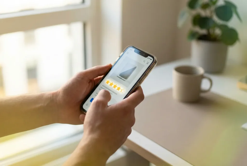
The Spiegel Research Center at Northwestern University measured how strong reviews are. A product with 5 reviews was 270% more likely to be purchased than a product with no reviews. But every additional review added less and less. And one more interesting finding: products rated 4.0–4.7 stars sold best, not those with a perfect 5 – that looks suspicious [3].
Another interesting variant is the bandwagon effect. When something starts to get popular on social media, people join in mainly because others are joining in. TikTok trends are the perfect example.
How to use it: Collect and show reviews, testimonials, and case studies. The first reviews make the biggest difference – if your products don't have any yet, start there. Show numbers: how many people bought the product, how many customers you serve, which brands trust you. Specific numbers work better than vague claims like “thousands of happy customers.”
The scarcity principle – the less there is, the more we want it
The scarcity principle is as old as humanity. When something is scarce, we automatically see it as more valuable. The brain's reasoning is simple: if it's rare, it must be worth something.
The American streetwear brand Supreme turned this principle into an entire business model. It releases limited drops that sell out within minutes, and some pieces then resell for several times the original price. Not because they're objectively better. But because there are so few of them.
Scarcity works with time, too. Amazon has Lightning Deals with a countdown timer, and online stores count down to the end of a sale. Even if you suspect a similar price will be back soon, the countdown creates a sense of urgency and the fear of missing out, or FOMO.
But the line here is thin. In 2019, the UK Competition and Markets Authority (CMA) made Booking.com, Expedia, and other booking sites stop using messages that put unnecessary pressure on customers – such as a false “only one room left” [4].
How to use it: Work with quantities or deadlines that are genuinely limited: limited editions, a real end date for a sale, a “3 left” label. When you say there are 3 left, make sure there really are 3 left. Fake scarcity is spotted quickly and destroys trust.
Loss aversion – losing hurts about twice as much
Daniel Kahneman and Amos Tversky showed that a loss hurts us roughly twice as much as an equal gain pleases us. A large 2024 meta-analysis, which reviewed more than 600 estimates from 150 studies, arrived at a ratio of about 2:1 [6]. Losing $100 feels much worse than finding $100 feels good.
That explains why so many services offer a free trial – from streaming services to software tools. Not out of charity. Once you get used to a service, losing it hurts more than what you pay for it.
A related idea is the endowment effect. We value the things we already have more highly than they're objectively worth. That's why free trials work so well: once the service is “yours,” you don't want to give it up.
How to use it: Show customers what they'll lose if they don't act – or put the thing in their hands before they pay. Free trials, money-back guarantees, risk-free offers – all of them are built on loss aversion. Whether “Don't miss out on…” or “Get…” works better for your audience, don't guess – test both versions.

Reciprocity – give, and you'll get something back
The principle of reciprocity is deeply rooted in human nature. When someone gives us something, we feel the need to return the favor. And it works in marketing, too.
The American warehouse club chain Costco is known for the free samples in its aisles. According to the company that runs the sampling for Costco and other chains, samples raised beer sales by an average of 71% and frozen pizza sales by 600% [7]. Part of the effect is simply that people get to know the product. But behavioral economists also point to reciprocity: someone who got something for free feels the need to “pay it back” and buys the whole pack.
In digital marketing, reciprocity works through valuable free content. HubSpot built its entire growth on first giving away high-quality ebooks, tools, and educational materials – and even a basic CRM – for free. When companies later needed a paid tool, they already knew HubSpot and trusted it.
How to use it: Offer value before you ask for anything. It could be free content, a sample audit, a free consultation, or just a genuinely useful article (like this one 😉). The more real value you give up front, the stronger the urge to return it.
The decoy effect – a third option changes the game
The decoy effect is one of the cleverest tricks in pricing. It works like this: by adding a third, deliberately worse option, you change how people see the other 2.
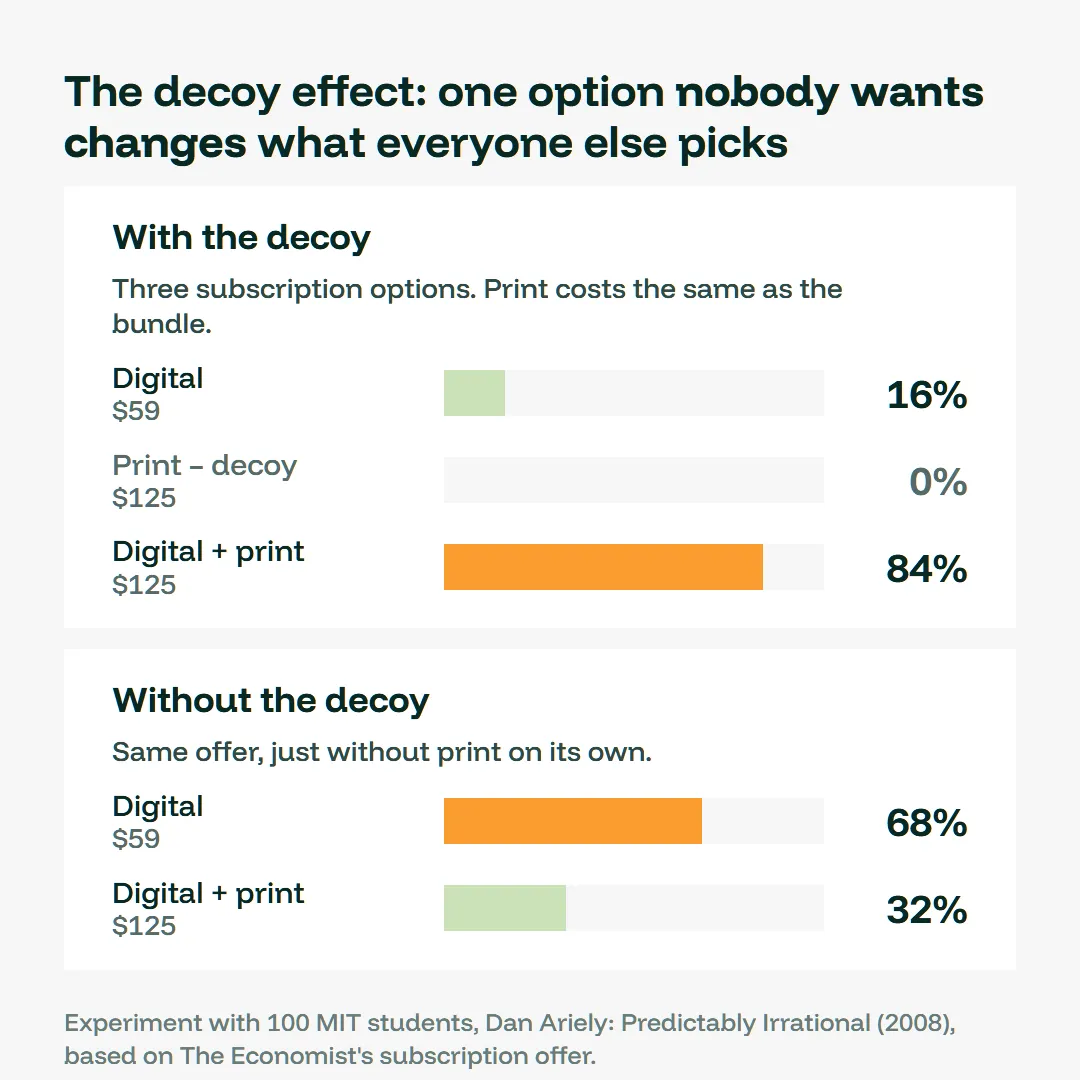
In his book Predictably Irrational, Dan Ariely described the famous case of The Economist. The magazine offered 3 subscription options: digital for $59, print for $125, and a bundle (digital + print) also for $125. Print on its own at the same price as the bundle made no sense – and that's exactly why it was there.
Ariely tested it on 100 MIT students. With all 3 options, 84% chose the bundle and 16% chose digital, and nobody picked print. When he removed the decoy, it flipped: 68% chose digital for $59 and only 32% the bundle [8].
You'll often see the same principle at the movies: a small popcorn for $4, a medium for $7.50, and a large for $8. The medium is there mainly to make the large look like the obvious choice.
How to use it: If you offer 2 options and want people to choose the more expensive one, add a third option that's priced close to the expensive one but offers much less. This works especially well for bundles and pricing plans – and measure the result, because not every audience reacts the same way.
The framing effect – how you say it changes everything
The framing effect shows that the way you present information often matters more than the information itself. Same fact, different wording, and a completely different reaction.
“$2 off when you pay in cash” vs. “a $2 surcharge when you pay by card.” Financially it's the same, but the first sounds like a reward and the second like a penalty.
An even stronger example comes from medicine. In a classic 1982 study, patients, doctors, and students were given the same data on lung cancer treatment – once as the probability of survival, once as the probability of dying. When it was framed as “survival,” significantly more people chose surgery, and that included doctors [9]. Same numbers, different framing, different decision.
How to use it: Test how the same thing said 2 different ways lands with your audience. Present fees and surcharges as a discount for the better choice, and state benefits specifically. And prices? “Save $20” works differently than “only $80 instead of $100,” even though it's the same thing. A test tells you which version wins, not a hunch.

The paradox of choice – too many options paralyze
Psychologist Barry Schwartz popularized this principle, and it's one of the most underrated in marketing. It says something simple: the more options you give people, the harder it is for them to decide. And often they don't decide at all.
The famous jam experiment shows it clearly. Sheena Iyengar and Mark Lepper set up a jam tasting stand in a store – once with 24 flavors, another time with just 6. The larger selection attracted more curious people, but only 3% of them bought anything. With the smaller selection, 30% bought [10].
Honesty matters here, though: later meta-analyses showed that the effect isn't universal. It kicks in mainly when the choice is complex, the options are hard to compare, and the customer doesn't know in advance what they want [11]. People who know exactly what they're looking for appreciate a wider selection.
Netflix handles this cleverly. Instead of the whole catalog, it serves you short personalized rows: “Top picks for you,” “Because you watched…,” “Trending now.” It simplifies the decision for you.
How to use it: Limit the number of options where customers are deciding for the first time or don't understand the differences. Three pricing plans instead of 7. And if you have a large catalog, offer filters, curated picks, or recommendations like “most popular choice.” Simplicity sells.
What to take away from this
Marketing psychology isn't about manipulation. It's about understanding how people really think and make decisions. When you know these principles, you can design prices and offers that make sense to your customers, build trust, and create content that gets people to act.
These 9 principles are just a selection. There are many more: architect Alan Penn of University College London, for example, described how IKEA leads customers along a one-way route through the entire store. And back in 1982, a supermarket study showed that slower music slowed down how people moved through the aisles and raised sales [12].
One thing holds for all of them, though: a psychological trick on its own won't replace a strategy. If you don't know who you're selling to and why they should choose you, even the best anchor won't help. I explain why in my article on why tactics fail without a strategy. And the article on how to choose your brand archetype shows how to use psychology in your brand's character, too.
Pick one principle from this article and try it in your marketing this week. Rewrite a line on your homepage. Add reviews to your sales page. Or look at your pricing and consider a third option. Just decide up front what you'll measure – so you know whether the change worked, and it isn't a gut feeling that decides.
FAQ
Is marketing psychology manipulation?
Not as long as it's built on the truth. The line lies where you claim something that isn't true – made-up scarcity, an inflated original price, or reviews nobody wrote. A simple test: would your message hold up if the customer could see how things really are?
What is behavioral economics, and what does it have to do with marketing?
Behavioral economics studies how people actually make decisions, not how they would decide as perfectly rational beings. Daniel Kahneman (2002) and Richard Thaler (2017) won the Nobel Prize in Economics for their contributions to the field [13]. Most of the principles in this article – anchoring, framing, loss aversion, and the endowment effect – come from there.
What is neuromarketing?
Neuromarketing is a field between marketing and neuroscience that measures how the brain and body react to an ad, packaging, or a website – for example with EEG or eye tracking. The principles in this article aren't based on it; they come from behavioral economics experiments. For a typical business, it's more practical to test 2 versions of a page or an offer and see what people actually do.
How do colors influence customer decisions?
Color changes how we perceive a brand or a product, but it doesn't work like a universal switch along the lines of “red sells.” Research shows that what matters more is whether the color fits the product: for functional products, people rate “functional” colors like blue more highly, and for products built on experience and the senses, colors like red [14]. So choose colors based on what your brand should express, not on a chart of their “meanings.”
Share the article